CerciOeiras.
- Year
- 2025
- Client
- CerciOeiras
- Made
- Identity, web, product
- Classes
- Branding, UX, Project
- Identity
- Product
- Space
- Garment
- Food
- Image
CerciOeiras is a cooperative in Oeiras that helps people with cognitive and physical disabilities live more independently. For a semester we designed with them: a new identity around their own logo, two web pages that make games and tasks easier to reach, and an art stand with a silicone grip for clients who find holding a pencil hard.
Ingredients
What we started with- Brief
- Design for the people at CerciOeiras, clients and staff: their brand, their digital tools, and an object that helps with daily activities.
- Constraints
- Users with different cognitive and motor needs, many who can’t read easily. Everything had to work without instructions.
- Tools
- Illustrator, InDesign, Blender, AutoCAD, cardboard prototypes and a 3D printer.
- Time
- One semester, September 2025 to January 2026, across our Branding, UX and Project classes.
- Team
- Matilda Sørensen, Maria Grave and me. I worked on the identity, the landing pages, the art stand, the grip and the posters.
- Result
- A brandbook, pictogram posters, two tested web pages, an art stand prototype and a 3D-printed grip.
Method
How we made it — 01 to 07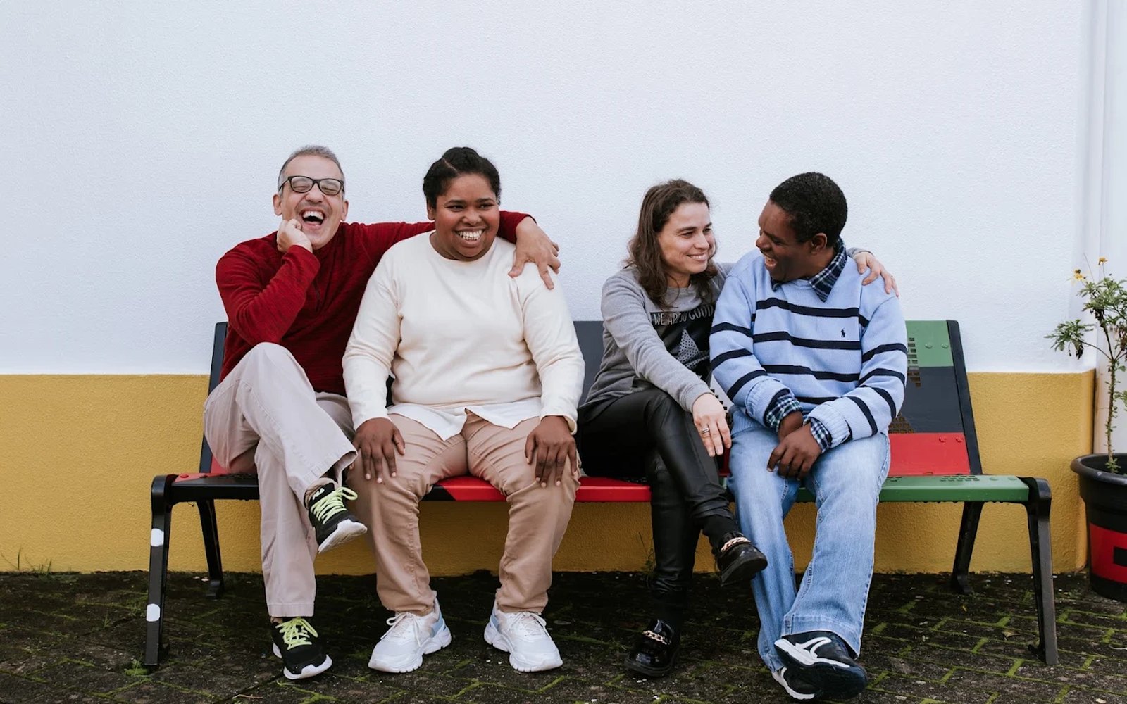
Visit and listen
We started at the centre, watching clients and staff through a normal day. Clients struggled to find and open their digital games alone; staff had to open every link by hand. We wrote it down as personas, journey maps and a task flow.
Their logo, a new system
CerciOeiras already had a logo: two hand-drawn figures. We kept it and built everything around it: blue, orange and yellow, simple symbols, and a set of shapes that turn into lines and patterns.
The lines and patterns, built from the same shapes
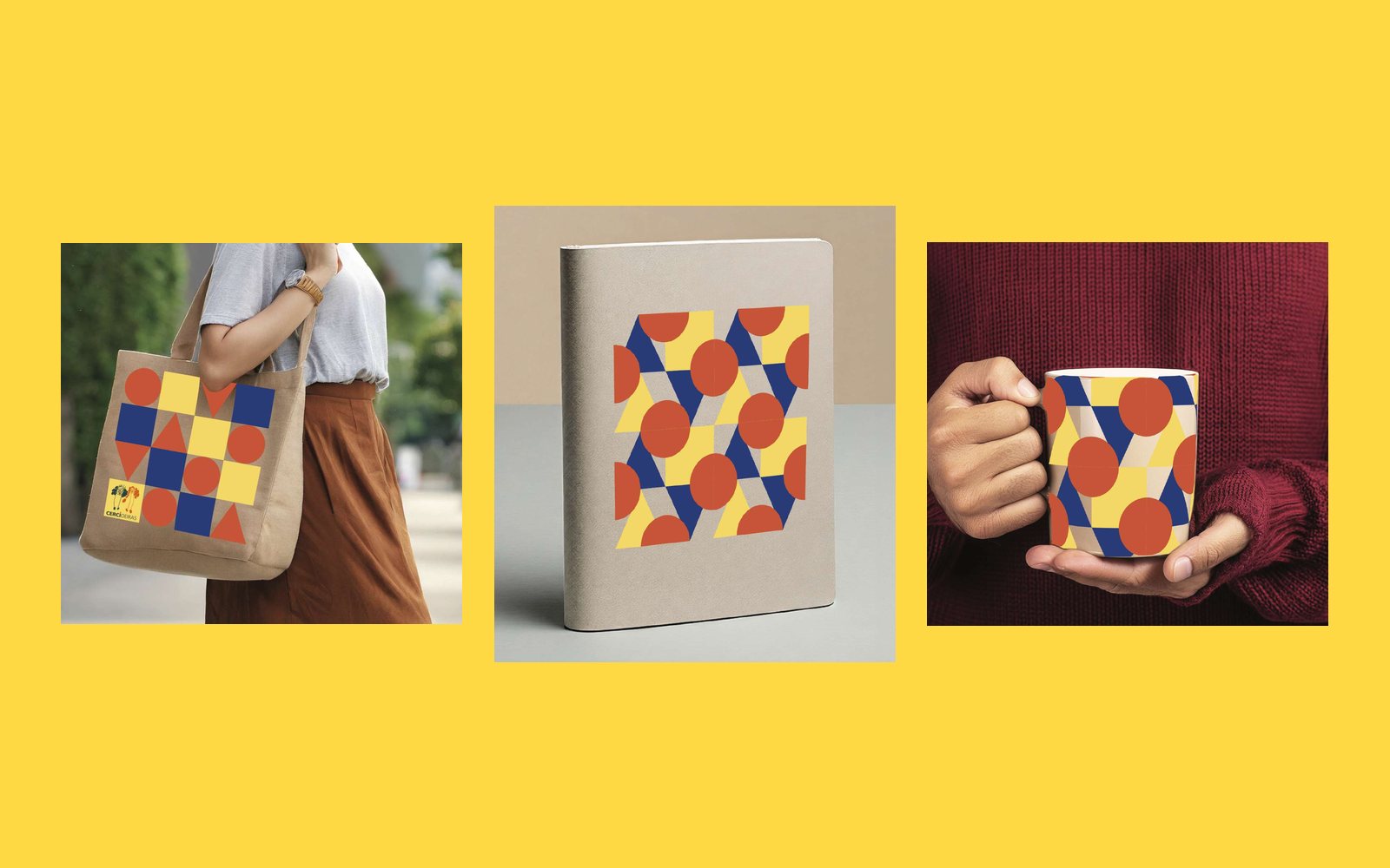
The pattern at work
The shapes stack into patterns for the things the centre uses every day: stationery, T-shirts, bags, notebooks and mugs.
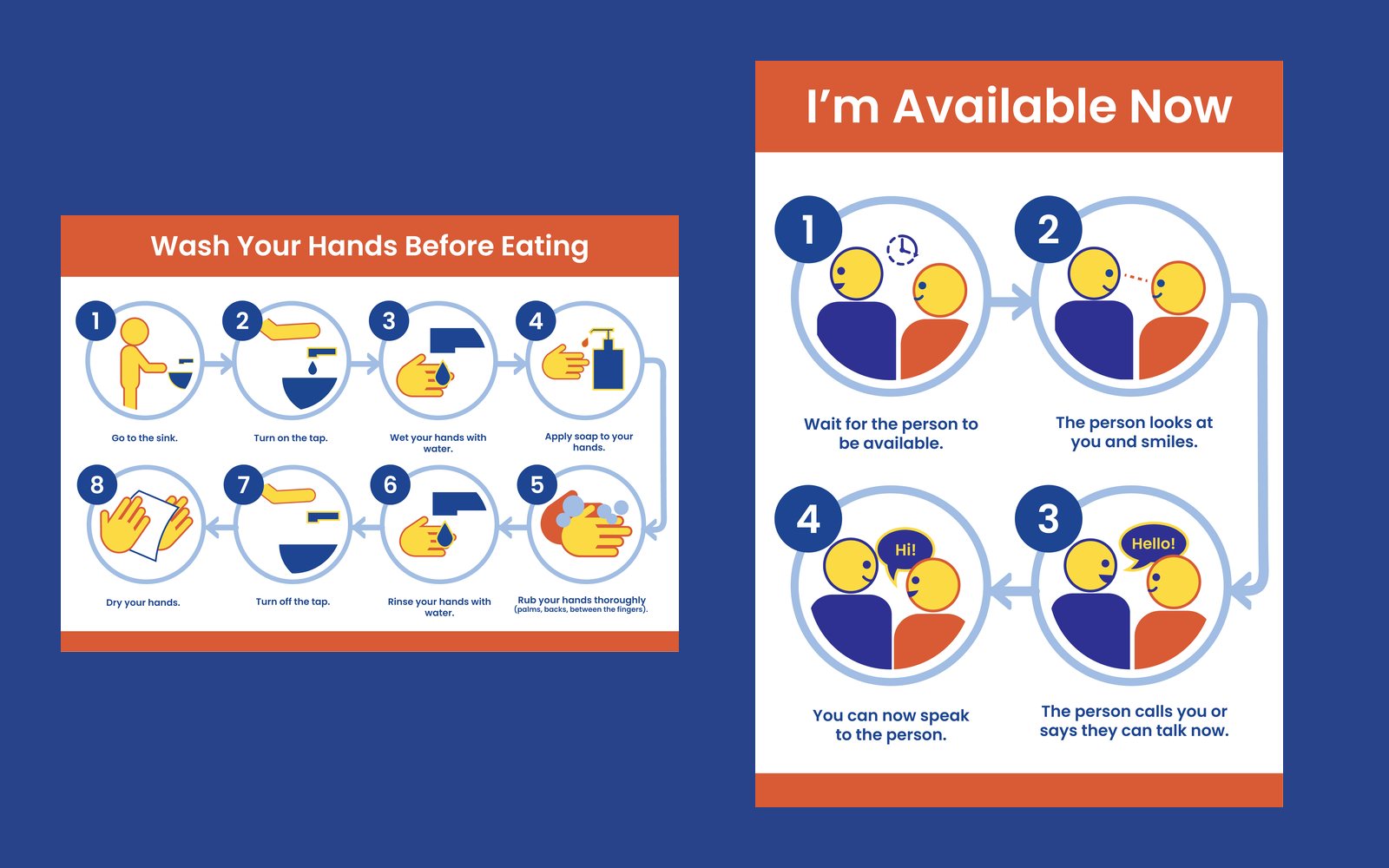
Pictogram posters
Step-by-step posters for daily routines, like washing your hands or waiting for someone to be free to talk. Big pictures, numbered circles and a few words, so they can be followed without reading.
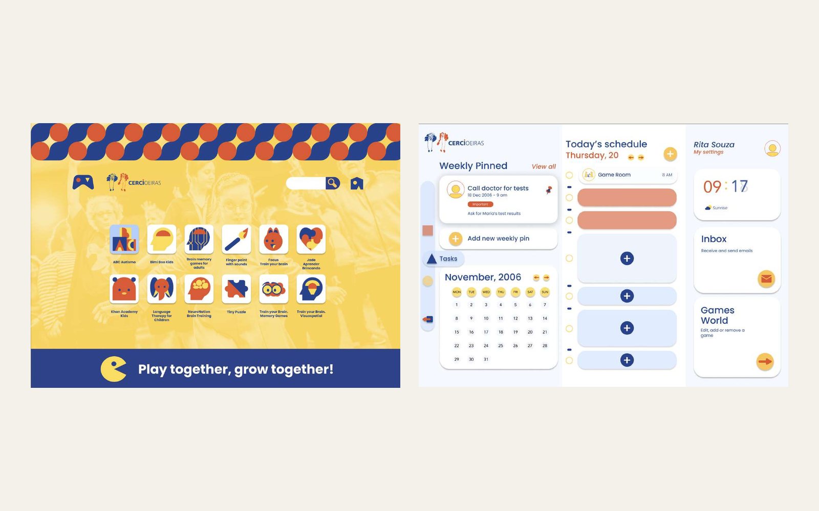
Two landing pages
For clients, one page with every game as a big, colour-coded icon: no links to remember. For staff, a dashboard with the day’s schedule, messages and a place to add or remove games. We tested both with a usability protocol and refined them.
The art stand
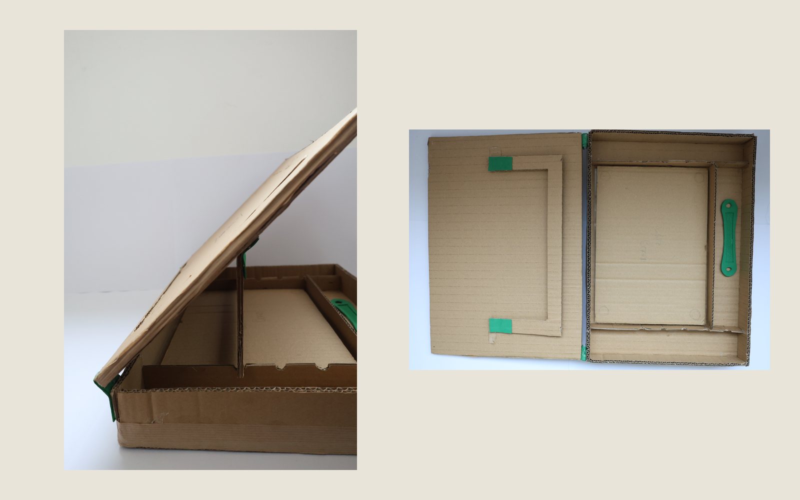
An A3 box for clients with motor difficulties that opens into a tilting drawing board. The front is magnetic, boards swap in and out, and the tools live inside. We tested the idea in cardboard first, then modelled the wooden version.
The grip
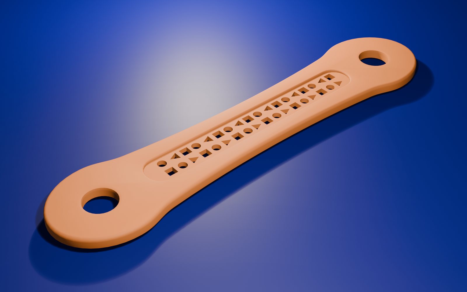
A silicone strap that locks the box shut for carrying. Take it off, bend it into a ring, and the holes at its ends hold a pencil or brush, so the hand doesn’t have to grip. We modelled it in Blender and 3D printed it. Drag to turn it.
The grip, filmed
Rendered in BlenderNotes
Looking back
Designing with real people, at their centre, with their needs, changed how I work. We went from what we saw on a visit to a box and a grip we actually built, and I learnt to design for different bodies and minds.