Moscavide.
- Year
- 2026, ongoing
- Module
- Assembling Urban Communities
- Made
- Research, identity, wayfinding
- Proposal
- Vizinho para Vizinho, a food festival
- Identity
- Product
- Space
- Garment
- Food
- Image
Map data © OpenStreetMap contributors
Moscavide is a neighbourhood of many languages with nowhere to meet. We listened to the people who live and work there, then designed a food festival to bring them together, with an identity found in the neighbourhood itself, and signs anyone can follow.
Ingredients
What we started with- Brief
- Assembling Urban Communities: research a Lisbon neighbourhood and design something that brings its people together.
- Constraints
- Nine languages, every age, people passing through and people who never leave. It had to work without words.
- Tools
- Interviews, observation, shadowing, aerial photos, Illustrator and InDesign.
- Time
- Autumn semester 2026, ongoing.
- Team
- Fiona Albers, Beatriz Ferreira, Yelizaveta Shagday and me. I worked on the research, the identity and the wayfinding.
- Result
- A proposal: the Vizinho para Vizinho festival, its identity, pictograms, map and signs.
Method
How we made it — 01 to 08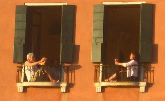
Observe
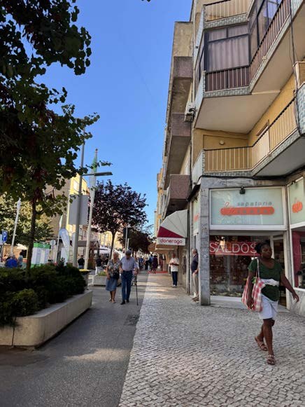
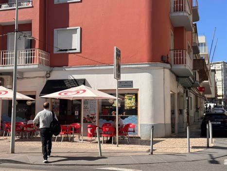
We sat on benches and followed people for a few minutes each. Moscavide moves in two ways: a route from A to B, or a string of small social stops at the café, the market and the garden.
Listen: 21 voices
We ran 21 interviews. Nine languages, four places of birth, every age. What was missing was a place to meet, and most people said food or music would bring them together. We chose food.
Letters from the roofs
We found our letters in aerial photos of the neighbourhood, traced on the shapes of its roofs. Every letter sits in the same 4 × 4 grid, so the alphabet stays consistent: the Moscavide font, discovered rather than designed.
Logo and pattern
Assembling Urban Communities: the logo is made of pieces, and the same pieces build the patterns, the way neighbours together make a neighbourhood. Warm colours, olive and orange, taken from the streets.
Pictograms
Signs that work without words, for every language and age. We redrew familiar public-space icons on a strict grid, with one stroke weight and square ends, so they belong to the same family as the letters.
The festival map
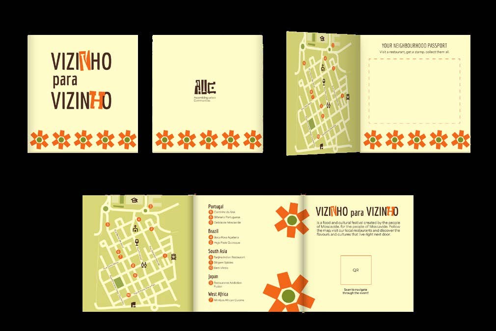
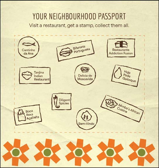
Vizinho para Vizinho, a food festival: ten restaurants, grouped by where the food comes from, from Portugal and Brazil to South Asia, Japan and West Africa. The map keeps only what you need: streets, parks, and the landmarks people already use.
Blade signs
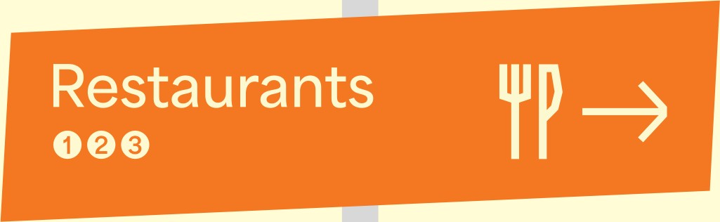
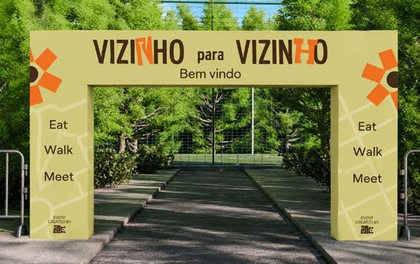
Every sign is one blade, built from the same unit: destination, symbol, arrow. They’re cut from the corrugated plastic Lisbon already uses on lampposts, fixed with two zip ties, and come down with one cut. Drag to turn.
On the day
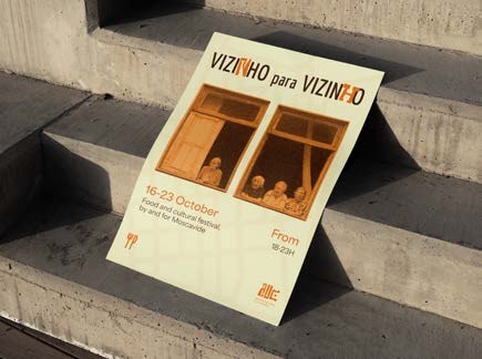
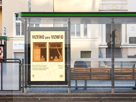
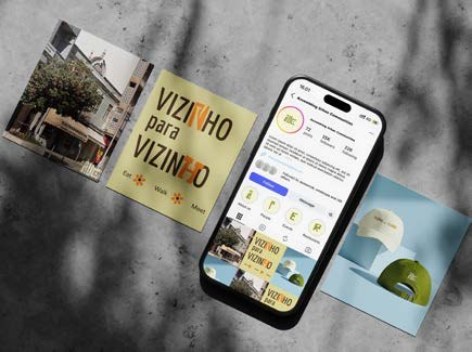
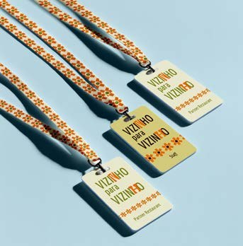
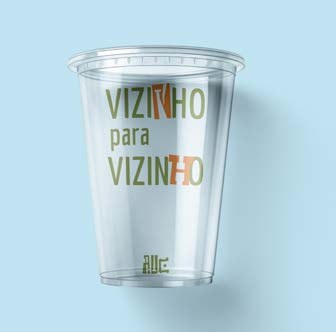
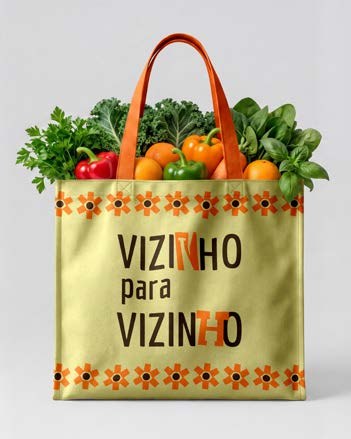
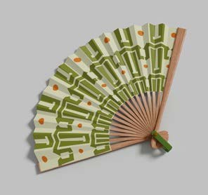
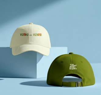
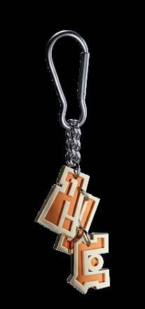
The team carried the identity onto everything people touch: the poster, the Instagram, a brochure with the map, a passport stamped at each restaurant, name tags, cups, and things to take home.
Notes
So far
Moscavide taught me that sometimes the answer is within the problem. We don’t need to look for a new solution; we just need to change perspective.